
Finding Balance…
I’m seeing a welcome shift in my work.
In the past, I would obsess over accuracy when it came to my maritime paintings. The painting was “done” when all the lines in the rigging were in the perfect places. I would use a ruler and pen to achieve the cleanest lines possible.
This process was good…as a guide.
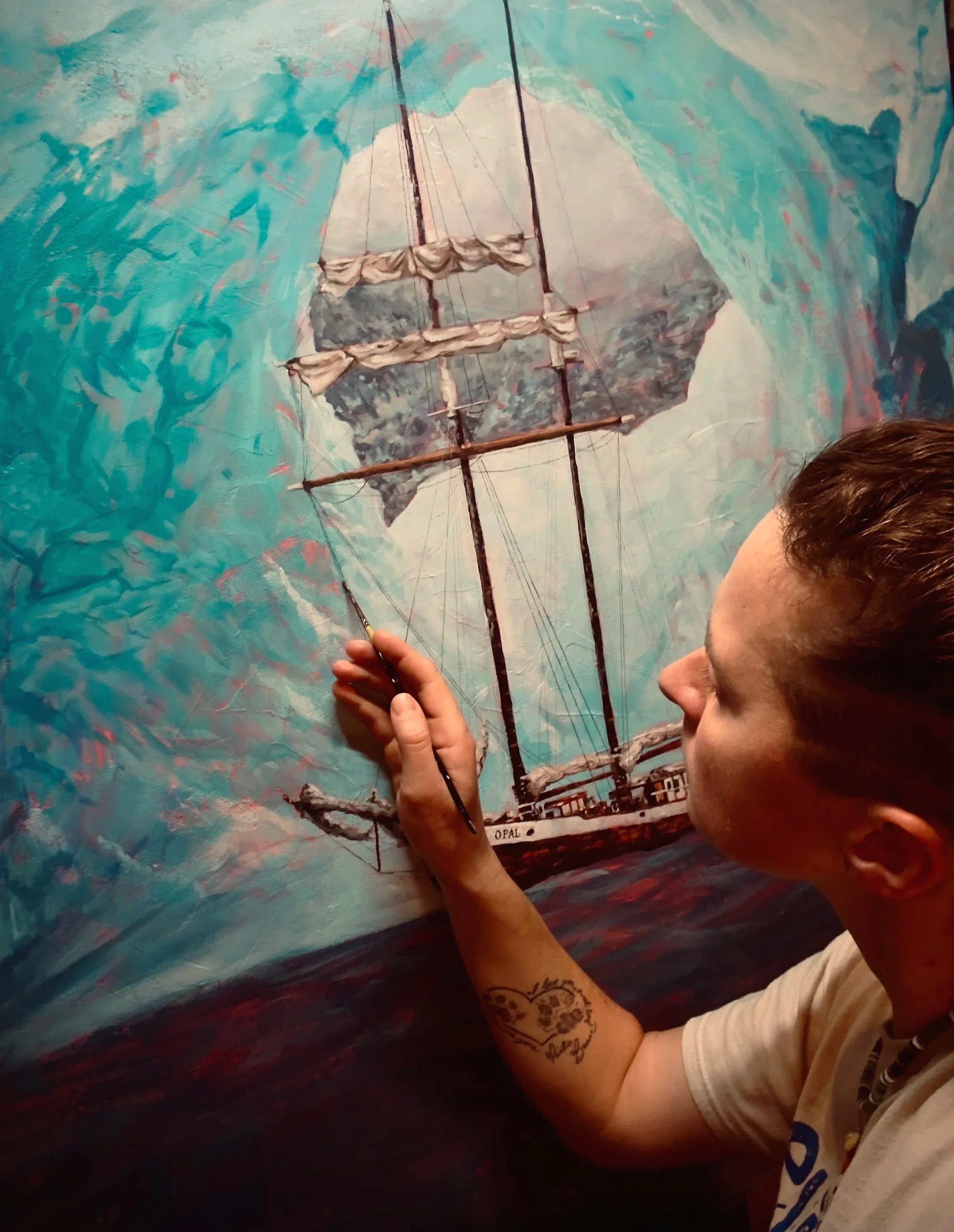
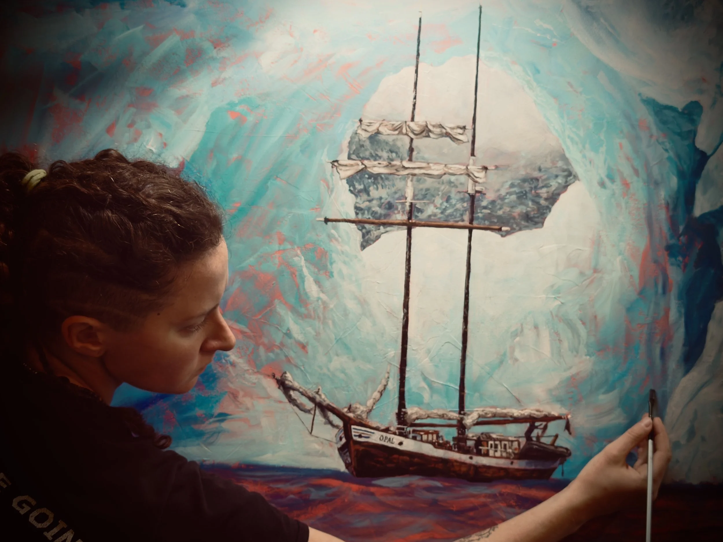
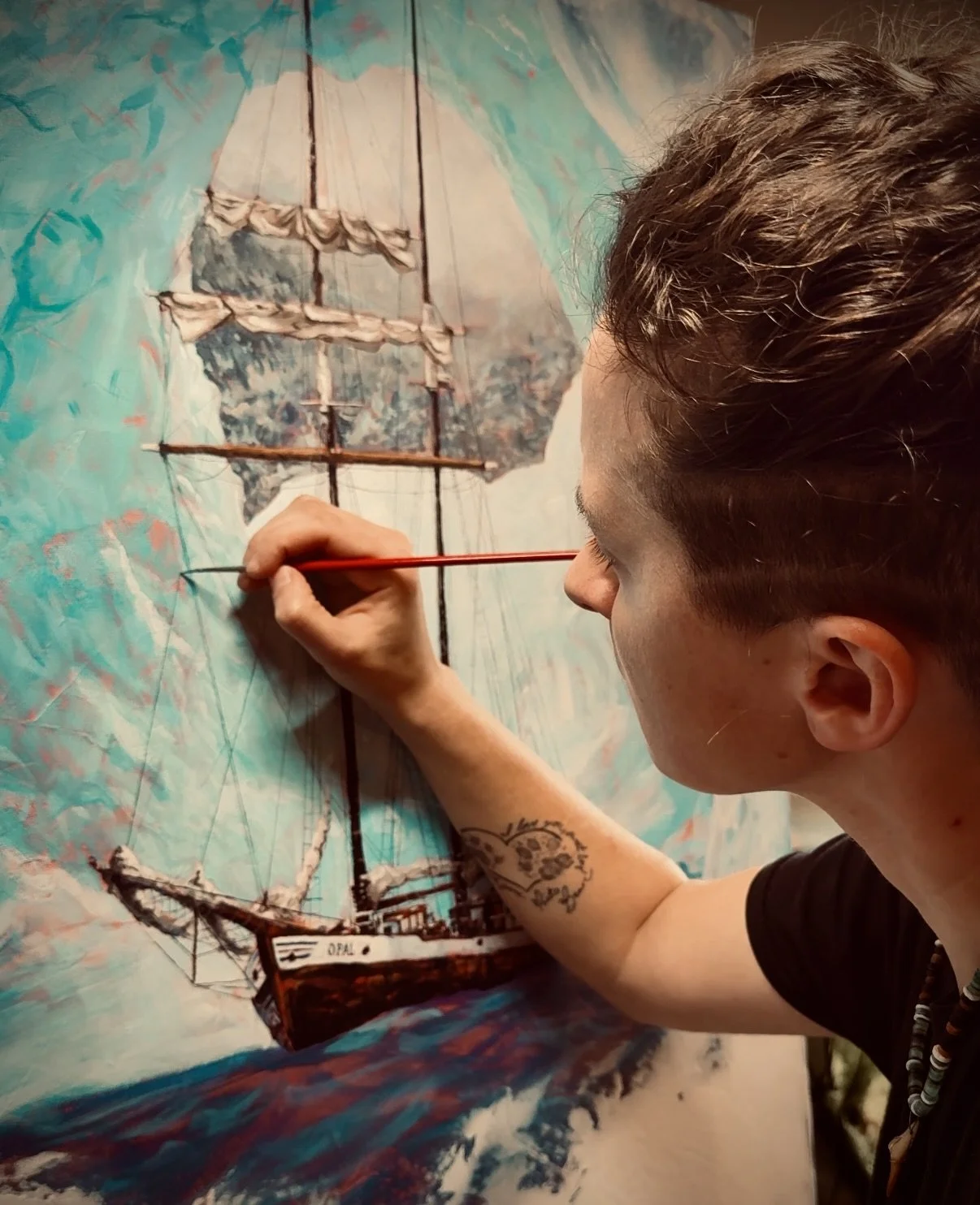
As I’ve started moving to larger canvases with more room to play and use larger brushes, I’ve felt my hand loosening up a bit. Absolutely, I still study a ship’s rigging with multiple reference photos before I even begin to paint it, let alone start the linework.
Set. Douse. Set. Douse. Set. Douse…
Beginning impressions
But now, I use it as a guide more than something I must copy with the rigidity of sweaty palms and sore shoulders.
After studying many, many maritime paintings, I’ve come to identify characteristics that I resonate with the most. Strict lines feel lifeless. Ballooning sails feel exaggerated (most of the time). The ones I love the most are the artworks that not only capture the spirit of seamanship, but also the beauty and craftsmanship of the vessel itself. Detailed but…loose.
Such a difficult balance to find sometimes.
Using brushes instead of pens introduces a soft, human kind of imperfection that - strangely - gives the final piece that much more life. I darken some lines while lighten others until they’re barely visible. I purposefully introduce “imperfections” to accent specific parts of the rigging until the subject takes spirited form. I use large brushes to map out contrasts and impressions before I ever move on to tiny details.
Then I stand back. If the large impressions suffice, then they suffice.
The paintbrush is much more tedious than the pen
This approach requires a lot of painting close up and then studying from far away. It’s like a dance.
And I have to remember, it’s more about the impression than the accuracy. What gives the mood? How do I keep the shape and character of the boat while leaving some things up to the imagination?
The result is sharp detail from a distance with a peculiar, warm softness when you draw near and stand up close – it’s easy on the eyes, inviting to the soul…and I’m loving it.
For more content like this, sign up for the artist’s weekly newsletter!
Studio updates, deals and behind-the-scenes snippets. A warm place in your inbox that you actually look forward to.
No worries, no spam! Unsubscribe anytime.